
")
Punya Mishra is Associate Dean of Scholarship & Innovation and Professor in the Mary Lou Fulton Teachers College at Arizona State University (with an affiliate appointment in the Design School). As associate dean, he leads a range of initiatives that provides a future-forward, equity driven, approach to inter/trans-disciplinary educational research. He is internationally recognized for his work in educational technology; the role of creativity and aesthetics in learning; and the application of collaborative, design-based approaches to educational innovation. He has received over $11 million in grants; published over 200 articles and edited 5 books. With over 58,000 citations of his research, he is ranked among the top 2% of scientists worldwide and the top 50 scholars (top 10 in psychology) who have the biggest influence on educational practice and policy in the United States. An AERA Fellow (2024), TED-Ed educator (2023), he co-hosts the award-winning Silver Lining for Learning webinar as well as the Value Laden and Learning Futures podcasts. He is also an award-winning instructor, an engaging public speaker, and an accomplished visual artist and poet. More here…
Must reads
")
")
")
Webinars & Podcasts:
Value Laden (archived)
Apple | Spotify | Simplecast
Blog Posts
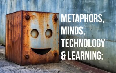
Metaphors, Minds, Technology & Learning
Note: The shared blogging experiment with Melissa Warr and Nicole Oster continues. This time we delve into metaphors of the mind, technology and generative AI. The core idea and first draft came from Melissa, to which I contributed a substantial rewrite. The final...
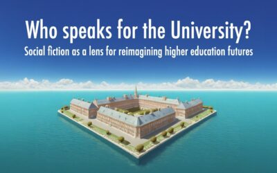
Who speaks for the university? Social fiction as a lens for reimagining higher education futures
Note: Image above created using Adobe Firefly, Photoshop and composed in Keynote. A few years ago, I had the pleasure of connecting with author Dr. Phoebe Wagner through the Center for Science and the Imagination at Arizona State University. We discussed her...
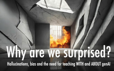
Why are we surprised? Hallucinations, bias and the need for teaching with and about genAI
By Punya Mishra, Melissa Warr & Nicole Oster Note: This is the first post in an experiment at shared blogging by Melissa Warr, Nicole Oster and myself. Over the past months we have found ourselves engaged in some fascinating conversations around genAI, education,...

SITE 2024: A recap
The Society for Information Technology in Teacher Education (SITE) conference has been an integral part of my professional journey for over two decades. My first presentation at SITE was back in 2001 with Matt Koehler and through the years, SITE has played a pivotal...
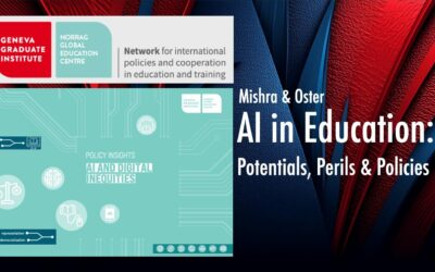
AI in Education: Potentials, Perils & Policies
NORRAG, based at the Geneva Graduate Institute, is a global network focused on international education policy and cooperation, known for its commitment to addressing under-researched topics related to education quality and equity and amplifying voices from the Global...
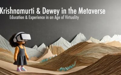
Krishnamurti & Dewey in the Metaverse: Education & Experience in an Age of Virtuality
What does it mean to have an educative experience? As Dewey famously wrote: The belief that all genuine education comes about through experience does not mean that all experiences are genuinely or equally educative ~ John Dewey Questions such as these come to...
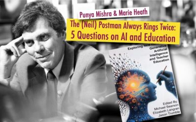
The (Neil) Postman Always Rings Twice: 5 Questions on AI and Education
Note: This post has also been cross-posted on the Civics of Technology blog. Marie Heath (with whom I recently co-wrote a blog post about GenAI in Teacher Education: A techno-skeptical perspective) and I were invited to write a chapter for an edited volume titled...
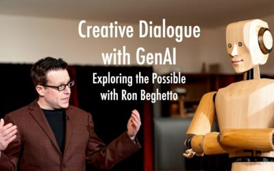
Creative dialogue with Generative AI: Exploring the Possible with Ron Beghetto
As part of our ongoing series for the journal TechTrends exploring the intersections of technology, education, and creativity, we have recently turned our focus to the potential impacts of generative AI (GenAI) on these domains. Our latest article features a...
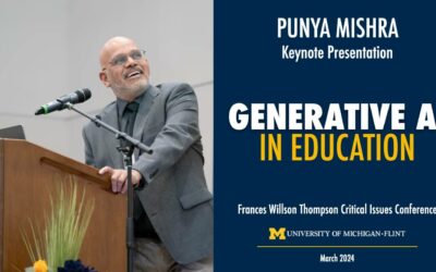
Generative AI in Education: Keynote at UofM-Flint
A couple of weeks ago I was invited to give a keynote at the Frances Willson Thompson Critical Issues Conference on Generative AI in Education. It was great to go back to Michigan even if for a super short trip. One of the pleasures of the visit was catching up with...
… or check out some random blog posts
What do they know? Video projects on understanding
In my summer classes I have the participants complete a video assignment on understanding. This year as always my students worked in groups over a week-and-a-half to select their topics, develop interview protocols, video tape people as they answered their questions,...
India Breakfast, a photo report
The India themed breakfast at the College of Education, a kick-off for India Week, was a great success. [Here is a previous blog entry announcing this (and other) events.] I would like to take this opportunity to thank all the people who helped out, and also provide...
SITE 2024: A recap
The Society for Information Technology in Teacher Education (SITE) conference has been an integral part of my professional journey for over two decades. My first presentation at SITE was back in 2001 with Matt Koehler and through the years, SITE has played a pivotal...
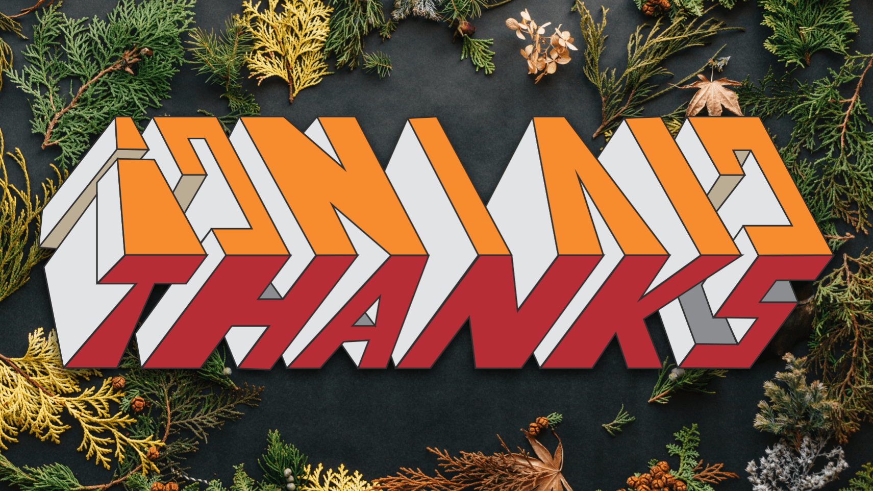
Happy Thanksgiving
A new design for my favorite holiday of the year. See animated version below. Enjoy Previous designs can be found here and here.
When does the brain make up YOUR mind?
When does the brain make up YOUR mind? Does this question make any sense? Anyway, this was prompted by an article that showed that "Researchers using brain scanners could predict people's decisions seven seconds before the test subjects were even aware of making...
Self-similarity in math & ambigrams 3/3
Self-similarity in geometry is the idea of repeating a similar shape (often at a different scale) over and over again. In other words, a self-similar image contains copies of itself at smaller and smaller scales, such as the image below of the word "zoom."...
Oh Wow! Oh Wow! Oh Wow!
Much has been written about Steve Jobs in the past few weeks since his passing but the best piece I have come across is the eulogy by his sister Mona Simpson. Mona Simpson is an author and professor of writing and delivered this eulogy on Oct. 16 at his memorial...
The 5 Spaces Framework for Design in Education: The growth of an idea
The Five Spaces for Design in Education framework argues that design in education happens in 5 interrelated spaces: artifacts, processes, experiences, systems and culture. We have typically represented this as follows. Over the past years we have published and...
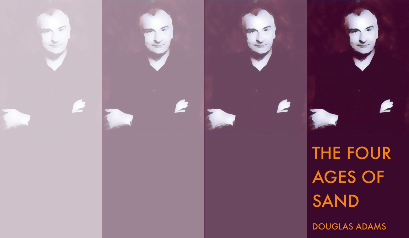
Douglas Adams & Computational Thinking
Illustration by Punya Mishra.See sketch of Douglas Adams at the end of this post. I have always been a huge fan of Douglas Adams, trying to sneak in his ideas into my academic writing whenever I can. I had written about my previous attempts in a blog post...