
")
Punya Mishra is Associate Dean of Scholarship & Innovation and Professor in the Mary Lou Fulton Teachers College at Arizona State University (with an affiliate appointment in the Design School). As associate dean, he leads a range of initiatives that provides a future-forward, equity driven, approach to inter/trans-disciplinary educational research. He is internationally recognized for his work in educational technology; the role of creativity and aesthetics in learning; and the application of collaborative, design-based approaches to educational innovation. He has received over $11 million in grants; published over 200 articles and edited 5 books. With over 58,000 citations of his research, he is ranked among the top 2% of scientists worldwide and the top 50 scholars (top 10 in psychology) who have the biggest influence on educational practice and policy in the United States. An AERA Fellow (2024), TED-Ed educator (2023), he co-hosts the award-winning Silver Lining for Learning webinar as well as the Value Laden and Learning Futures podcasts. He is also an award-winning instructor, an engaging public speaker, and an accomplished visual artist and poet. More here…
Must reads
")
")
")
Webinars & Podcasts:
Value Laden (archived)
Apple | Spotify | Simplecast
Blog Posts

Metaphors, Minds, Technology & Learning
Note: The shared blogging experiment with Melissa Warr and Nicole Oster continues. This time we delve into metaphors of the mind, technology and generative AI. The core idea and first draft came from Melissa, to which I contributed a substantial rewrite. The final...

Who speaks for the university? Social fiction as a lens for reimagining higher education futures
Note: Image above created using Adobe Firefly, Photoshop and composed in Keynote. A few years ago, I had the pleasure of connecting with author Dr. Phoebe Wagner through the Center for Science and the Imagination at Arizona State University. We discussed her...
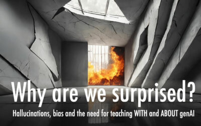
Why are we surprised? Hallucinations, bias and the need for teaching with and about genAI
By Punya Mishra, Melissa Warr & Nicole Oster Note: This is the first post in an experiment at shared blogging by Melissa Warr, Nicole Oster and myself. Over the past months we have found ourselves engaged in some fascinating conversations around genAI, education,...

SITE 2024: A recap
The Society for Information Technology in Teacher Education (SITE) conference has been an integral part of my professional journey for over two decades. My first presentation at SITE was back in 2001 with Matt Koehler and through the years, SITE has played a pivotal...
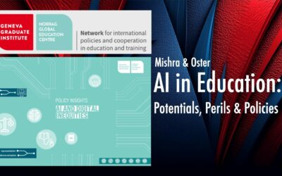
AI in Education: Potentials, Perils & Policies
NORRAG, based at the Geneva Graduate Institute, is a global network focused on international education policy and cooperation, known for its commitment to addressing under-researched topics related to education quality and equity and amplifying voices from the Global...
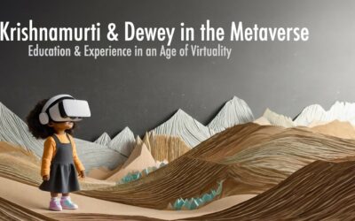
Krishnamurti & Dewey in the Metaverse: Education & Experience in an Age of Virtuality
What does it mean to have an educative experience? As Dewey famously wrote: The belief that all genuine education comes about through experience does not mean that all experiences are genuinely or equally educative ~ John Dewey Questions such as these come to...
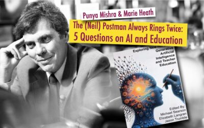
The (Neil) Postman Always Rings Twice: 5 Questions on AI and Education
Note: This post has also been cross-posted on the Civics of Technology blog. Marie Heath (with whom I recently co-wrote a blog post about GenAI in Teacher Education: A techno-skeptical perspective) and I were invited to write a chapter for an edited volume titled...
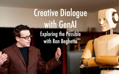
Creative dialogue with Generative AI: Exploring the Possible with Ron Beghetto
As part of our ongoing series for the journal TechTrends exploring the intersections of technology, education, and creativity, we have recently turned our focus to the potential impacts of generative AI (GenAI) on these domains. Our latest article features a...
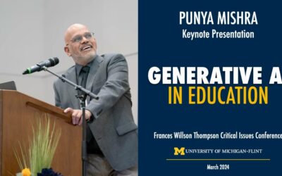
Generative AI in Education: Keynote at UofM-Flint
A couple of weeks ago I was invited to give a keynote at the Frances Willson Thompson Critical Issues Conference on Generative AI in Education. It was great to go back to Michigan even if for a super short trip. One of the pleasures of the visit was catching up with...
… or check out some random blog posts
Research conduct: The movie
From Ken Friedman & the PhD Design listserv: The current issue of The Scientist has a story on an interactive film that helps research students and early career researchers to understand and navigate the perils of research misconduct. Highlights: "The Lab is a...
The benefits of doodling!
Finally science has proved what I knew all along, doodling is a sign of an alert mind and may actually help memory!! Another justification for this, I guess.
Vijay Iyer, polymathy and trans-disciplinary creativity
Vijay Iyer, (http://vijay-iyer.com/) is an Indian-American jazz pianist and composer. He is a MacArthur Genius grant winner and is currently Franklin and Florence Rosenblatt Professor of the Arts at Harvard University and is widely regarded as being one of...
Visualizing mathematics
I love visual proofs of mathematical theorems. One visual proof I use quite often in my design courses (CEP817 or CEP917) is a visual proof of the fact that the sum of consecutive odd numbers is a square number. In other words: 1 + 3 = 4 = 22 1 + 3 + 5 = 9 = 32 1 + 3...
100 greatest mathematical theorems
Title says it all... check it out.
Pogue on design
David Pogue has couple of great examples in his latest posting about bad design in the world of software. Check out: It’s the Software, Not You. Potentially useful in CEP817/917...
Of teaching & cooking
Elizabeth Helfant over at Digital Learning Environments Blog has an interesting posting titled The Pancake principle. She makes a connection between technology integration and making pancakes, and offers three tenets of the Pancake principle. This posting is inspired...
Playing with light and shadows
Stumbled upon the creative work of Kumiya Mashita. It is amazing just how much can be created with just light and shadows. Just brilliant. Here are some examples:
Happy Diwali
Happy Diwali 2010 Readers of this blog know that every year I provide a link to the same interactive Diwali eCard. Why change anything this year? So follow the link below, turn your volume way up, and remember to click on the sky above the Taj Mahal for some...